i first started with this scanned ink drawing (i'll spare you from the two watercolor attempts)

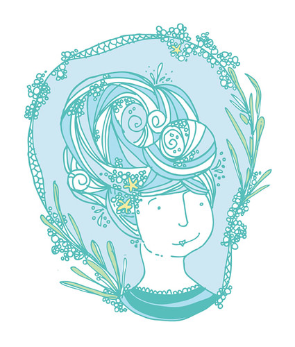
first color-way here in light blue/seafoamy greens
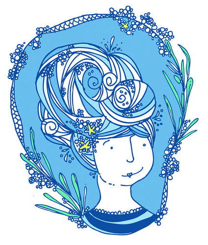
second color-way in deeper blues
i'm not sure which is like best?! its fun working digitally because with the click of a button you can re-do/un-do everything!

Love her! I think the lighter colors suit her best. She has a vintagey look..reminds me of Amelia Bedelia. So I think the muted colors work best!
ReplyDelete