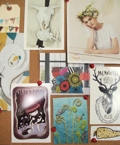
my new october inspiration board... i decided to go through old magazines/catalogues for this one and my eye was caught by creamy neutrals & hand drawn line work.

another illustrator piece! i sketched this same idea next to the previous, ocean swept, so i think they have a similar feel. blogger seems to have really desaturated this one making the greens/browns look gray-ish. flickr has a better version (on my screen at least!)


Definitely a similar feel. So pretty! How are you liking Illustrator?
ReplyDeleteaww thank you :) illustrator is officially less frustrating & starting to woo me in!
ReplyDelete